Here we have the Logo Design for Soaring High Marketing Solutions.
They have been in business for a few years, I am grateful for their trust in Neuro Graphic Design to craft the logo they had envisioned.
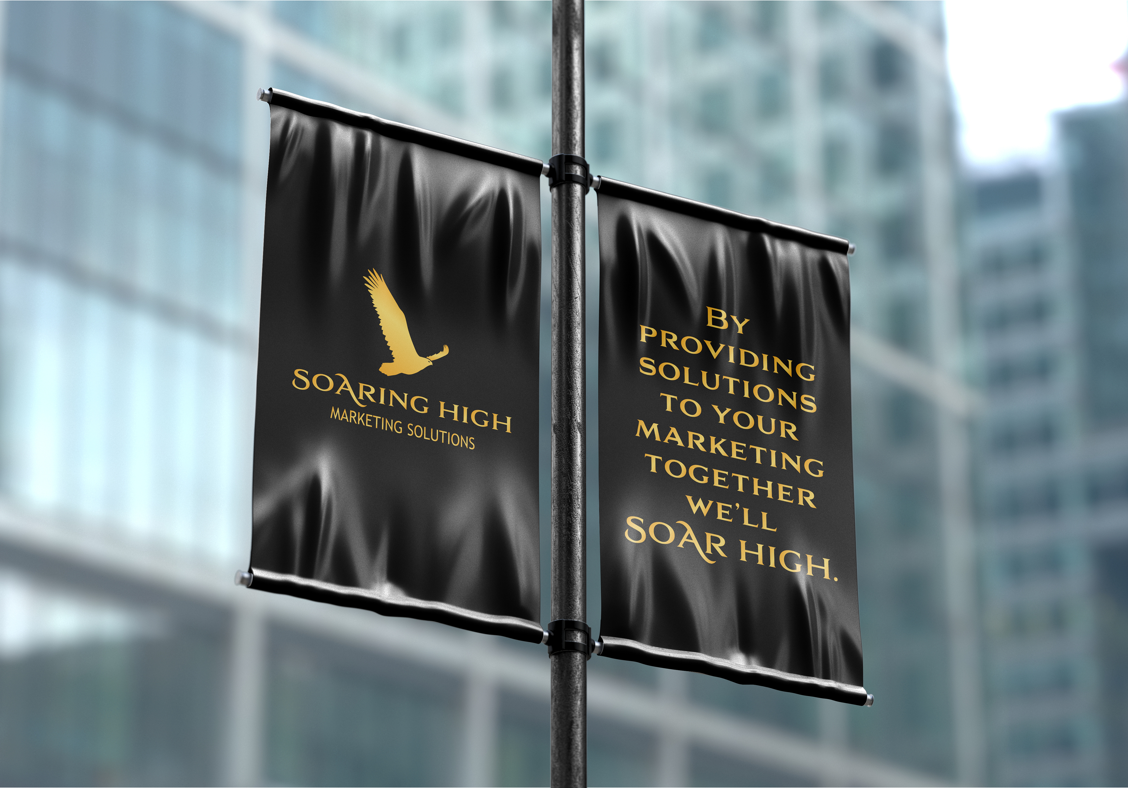
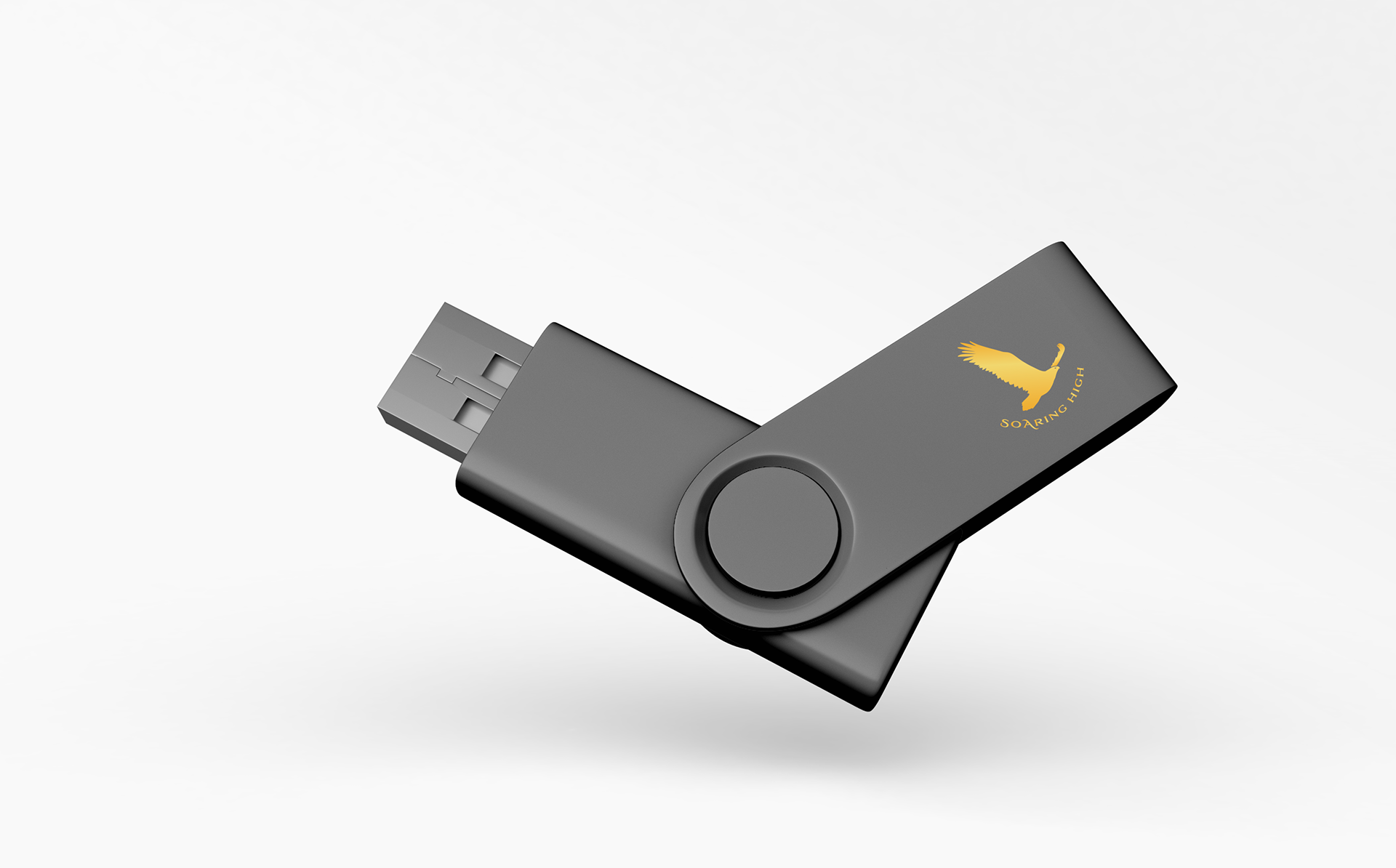
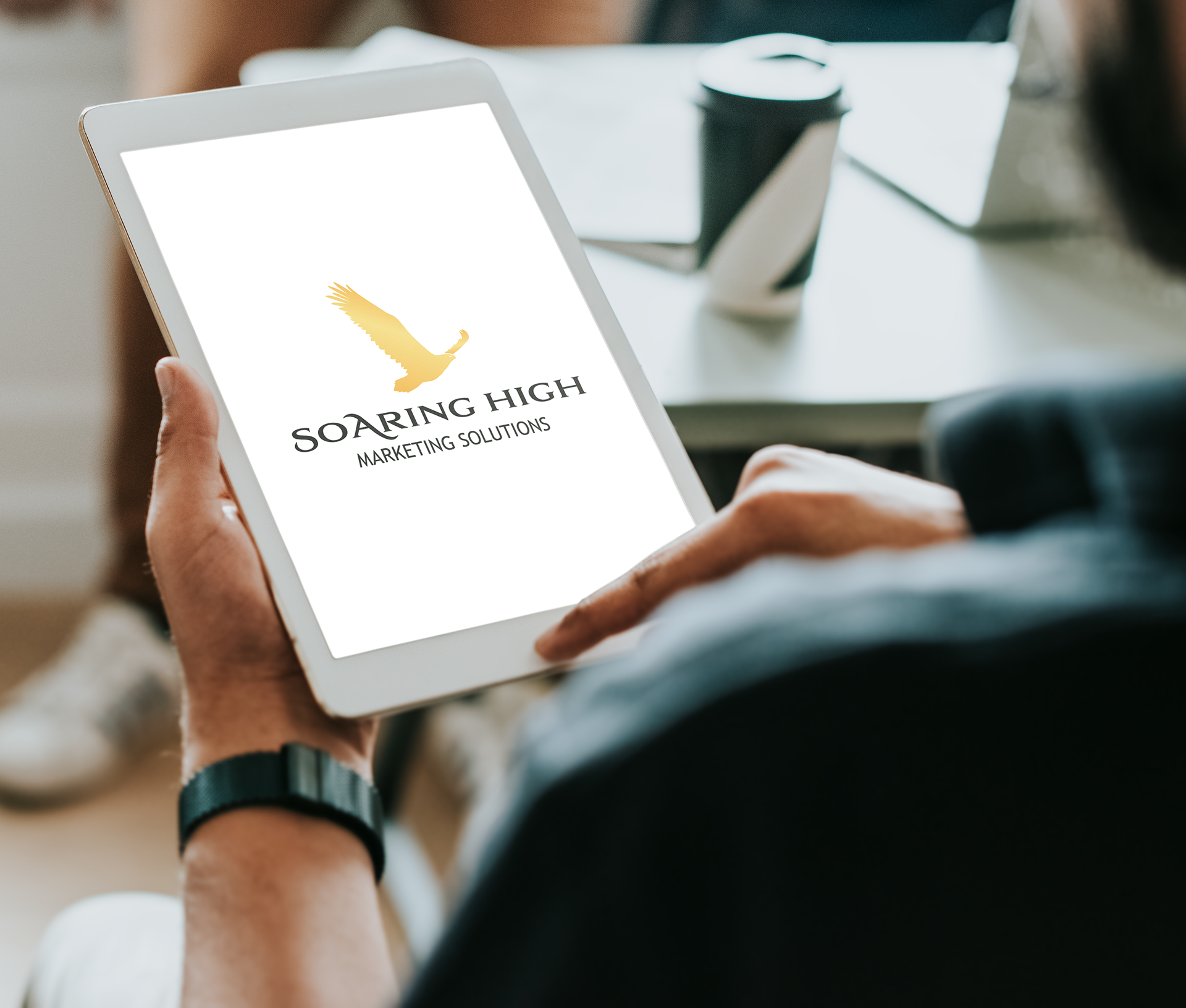
An eagle has been a representation of their business since they started because clients that work with them are going to Soar High in their marketing efforts.
I created a silhouette of an eagle to maintain simplicity. The eagle’s wings are positioned to resemble the eagle going up to further emphasize the soaring high.
The font was selected to have a sophisticated professional look. While complementing the overall logo with the small end details on the letter S and A from “Soaring High”.
In the creation of the submark logo I place the name on the bottom wrapping around slightly to give it a feel of going upwards.
The color palette of black and gold further emphasizes the quality of their services and how working with them clients can expect to have a high ROI.
They have been in business for a few years, I am grateful for their trust in Neuro Graphic Design to craft the logo they had envisioned.
An eagle has been a representation of their business since they started because clients that work with them are going to Soar High in their marketing efforts.
I created a silhouette of an eagle to maintain simplicity. The eagle’s wings are positioned to resemble the eagle going up to further emphasize the soaring high.
The font was selected to have a sophisticated professional look. While complementing the overall logo with the small end details on the letter S and A from “Soaring High”.
In the creation of the submark logo I place the name on the bottom wrapping around slightly to give it a feel of going upwards.
The color palette of black and gold further emphasizes the quality of their services and how working with them clients can expect to have a high ROI.